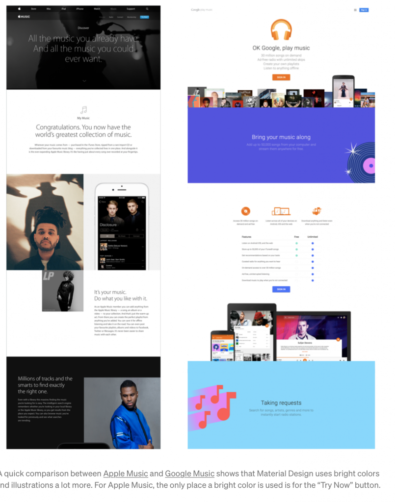
iOS puts the users content first in its design, while Google relies on bright coloured titles and buttons while putting users content underneath it.
The word skeuomorph comes from the Greek words skeuos (meaning “container or tool”), and morphḗ(meaning “shape”). In product design, we define skeuomorphism as a technique used in UI design where objects, icons, and buttons mimic their real-world counterparts. For example, a trash icon that looks like a trash can.
Why do this? For one, it helps us improve human-computer interaction (HCI). This was important back in the 1980s when the personal computer was a new concept for almost everyone. Big companies like Apple tried to minimize the learning curve by creating elements and icons that would look familiar to users. Steve Jobs loved skeuomorphism because he believed it made technology easier for people to use.